

Whitney Museum Ticketing Challenge
Project Type: Personal Project
Target Group: The Whitney Museum of American Art Team
Format: Digital, Printed (2.5” x 5”)
Category: Graphic Design, Info Design, Branding Design, Logo Design,
Project Duration: 5 Weeks
Target Group: The Whitney Museum of American Art Team
Format: Digital, Printed (2.5” x 5”)
Category: Graphic Design, Info Design, Branding Design, Logo Design,
Project Duration: 5 Weeks
The "Whitney Museum Ticketing Challenge" is a personal project that stems from my enriching museum experiences in New York City, with a special focus on the Whitney Museum of American Art. Throughout the summer of 2023, I had the wonderful opportunity to explore numerous exhibitions across various museums in the city, including Cooper Hewitt, MoMA, Guggenheim, and the Whitney. It was during these visits that my fascination with graphic design, specifically ticketing design, grew immensely.
Museum tickets hold great significance for me. They go beyond being mere practical entry passes; they embody the essence of the museum's language and visual identity all packed into a humble piece of paper. These tickets also evoke a strong sense of nostalgia, almost like cherished memorabilia. Not only do they provide essential details like the date and location, but sometimes they even include information about the exhibited works and their schedules. On occasion, I would jot down personal reflections about my day, who I was with, and how it unfolded, directly on the ticket itself. A deep personal attachment to museum tickets became evident.
Visiting the Whitney Museum in May for the exhibition "Project For A New American Century" by Josh Kline unlocked a door of opportunity for me to delve more into graphic design. The museum's ticketing system included two vertically oriented tickets, both displaying near-identical information. Moreover, I noticed that the COVID-19 details on the ticket appeared outdated and one side of the ticket remained predominantly blank. An opportunity for artistic exploration and enhancement was instantly thought of.
I tackled the project with three components in mind:
- Sustainability
- Deliver up-to-date information
- Evolve the current ticketing design rather than re-arranging.
*Not affiliated with Whitney Museum of American Art, for educational purposes
Problem Scope
Upon purchasing a ticket at the front desk of the Whitney, I received two pieces of ticketing paper, both displaying almost identical information. One of them served as a receipt, indicating the exact time of purchase. A more sustainable approach was immedietely evident. The ticket also contained COVID-19 information, which, being three years outdated, could be replaced with more relevant and purposeful content. Moreso, the backside of the tickets are predominantly blank which can seen as a canvas to develop further.
Design Process
- User Research
- Analysis of Current ticketing system
- Ideate/explore
- Iteration
- Prototype
Neue Haas Grotesk
A widely recognized and traditional sans-serif typeface designed by Max Miedinger and Eduard Hoffman between 1957 and 1958 for Haas’sche Schriftgiesserei in Switzerland. It emerged as a response to the popularity of British and German grotesque typefaces, which were influenced by the functionalist Swiss typography movement. It has been cemented into the Whitney Museum of American Art's branding since 2015.
The typeface was used ever since the rebranding of the Whitney Museum by Experimental Jetset Group in 2015, and has shaped the visual language of the museum ever since. It was only neccessary that the typeface is to be used continously to not break the relatively new design language for the museum.

User Research
To further understand the problems faced in the current ticketing system, I needed to understand through different perspectives. As a result, I interviewed museum-goers at the Whitney Museum by asking 5 questions. This user research initiative aimed to unravel the firsthand experiences and viewpoints of visitors, providing valuable insights into the existing ticketing system.
The five questions I asked are:
- How frequently do you visit museums, specifically the Whitney Museum? On a scale of 1 to 10, where 1 represents infrequent visits and 10 represents weekly visits, how often do you attend exhibitions?
-
What are your thoughts on the current museum ticket used at the Whitney Museum? What aspects of the ticket stand out to you, either positively or negatively?
- Regarding the QR code displayed on the rear of the ticket, do you typically utilize it? If not, what would encourage you to scan the QR code and interact with its content?
- Do you usually keep your museum tickets after visiting an exhibition, or do you tend to discard them? If you do keep them, what factors contribute to their value and make them worth preserving?
- Is there any specific information on the ticket that you feel could be improved or altered? Are there any additional details or features you would like to see incorporated into the ticket design to enhance your overall museum experience?
User 1: Alina P.
Age: 24
Focus: Machine Learning Researcher
Focus: Machine Learning Researcher
- Somewhat, I like to go to one exhibition at least once every two weeks. If my schedule permits, I would go once a week. I would say I am a 8/10.
- The museum ticket is pretty minimal compared to other institutions. It is fairly easy to read, and straightforward. One thing I dislike is the Covid info, I feel like it is quite meaningless.
- I dont, I feel like the museum itself has a lot of navigation signs that I don’t need any more assistance.
- I usually keep the first-time visit tickets from each museum I goto. Afterwards, I throw them away because they depict the same info, which isnt really special to me. I am also a minimalist so I don’t like to hoard them as I goto museums frequently.
- The covid info, I really think it is pointless and so 2020.
User 2: Justin K.
Age: 26
Focus: Architecture student
Focus: Architecture student
- I typically go once a month, as my schedule is pretty tight. I would not say I am a regular museum-goer but I do admire art. 4/10
- It’s straightforward, but I am unsure why they feel the need to give me two pieces of paper when they both carry the same information.
- Not really, I just utilize the floor directory that is displayed on each floor.
- I actually do. Since I don’t go very often, it feels special to me, especially when I go with my girlfriend or a friend of mine.
- I feel like the blank side of the ticket can have some design to it.
User 3: Alex C.
Age: 25
Focus: Employee at Dia Chelsea
Focus: Employee at Dia Chelsea
- I work in a gallery space itself during the week so I would say 9/10, as I also enjoy visiting other museums on my off days.
- Comparing it to our ticketing system at Dia (Beacon), we just offer a pin and sticker, a very minimalistic and intimate approach towards ticketing. The pin is up to the museum-goer to be kept or returned upon exit. The Whitney ticket is readable and minimal, but I don’t see a reason of having two same size pieces of paper each time I purchase a ticket.
- I do! Since I do not like to waste the handouts they give at museums, I utilize the digital version as it’s far more sustainable and in my opinion easier to use.
- I love to collect tickets, in fact, I have a box of tickets that I have collected amongst countless galleries and museums around the world. Some even have drawings and writings on them as I treat them like postcards. .
- Just some kind of design, especially on the rear of the ticket, I feel like the space can be utilized better!
Conclusion upon user interview discovery:
- Covid information on the museum ticket is unnecessary and seems outdated.
- Redundant information found on both pieces of paper should be eliminated to streamline the design, allowing space to open up for new designs.
- While the QR code is not frequently used, it can still serve as a sustainable option and should be retained in the redesigned ticket.
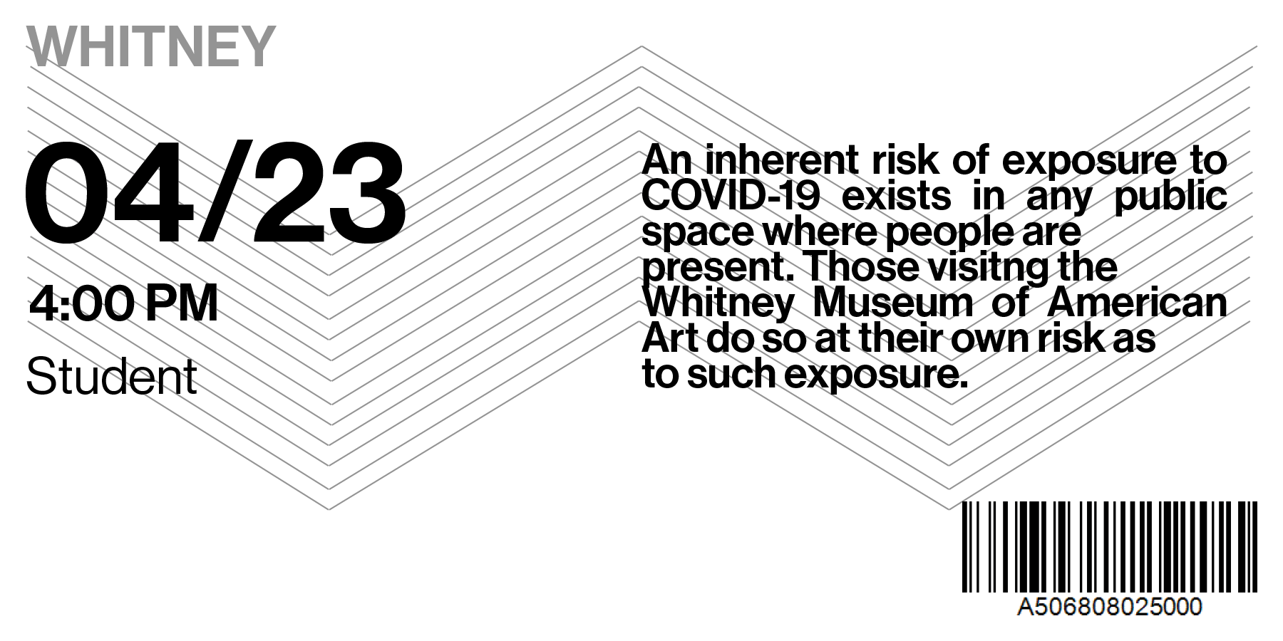
Current Ticket Design
Below is the current ticketing design used when visitors purchase through the front desk on the first floor of The Whitney Museum. (Ticket design via April 23, 2023)

Ideate
Horizontal Version
The design above showcases the ticket format through a horizontal perspective rather than a vertical one. Even though a ticket is readible vertically, the horizontal format allows more working space and for a design to be implemented.


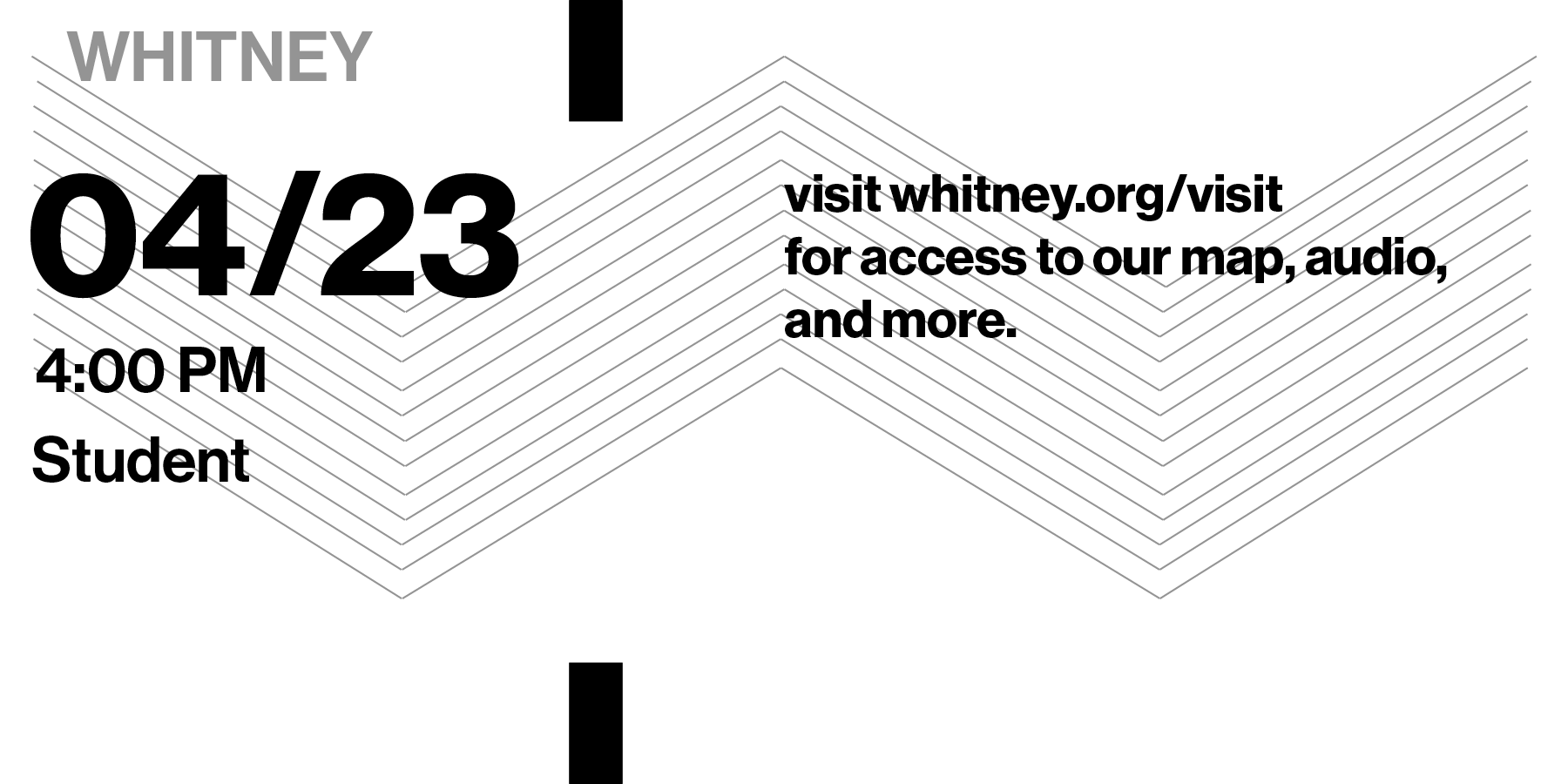
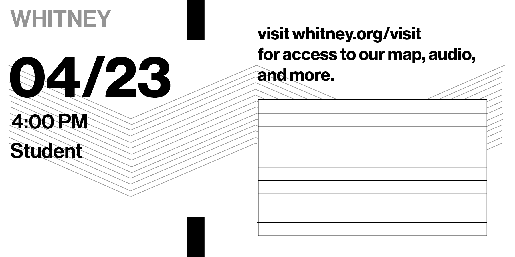
The proposed design with a lined area encourages user engagement by providing space for notes and writings, transforming the ticket into a multi-purpose tool. It goes beyond its traditional function and becomes a platform for personal expression and interaction, adding value and significance beyond being a simple ticket.
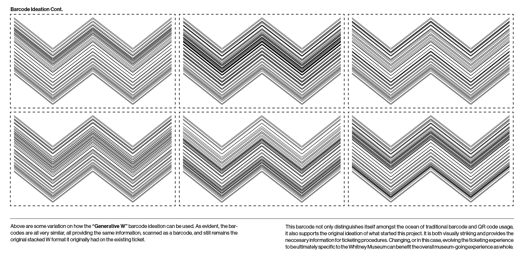
While the ticket can be re-designed countless ways to include user engagement directly (such as the one above), I contemplated the concept of evolution rather than a complete redesign. This led me to consider the barcode as a focal point for development, as it immediately emerged as a significant area of exploration for the next phase of the project.
During this process, It was important that the barcode is designed in a manner that not only captures the essence of the Whitney Museum's visual language but also retains the necessary information required for a ticket. By reinterpreting the barcode through the lens of the museum's unique aesthetic, I can create a visual element that becomes an integral part of the ticket's design, adding both artistic value and functional relevance.
Iteration #1
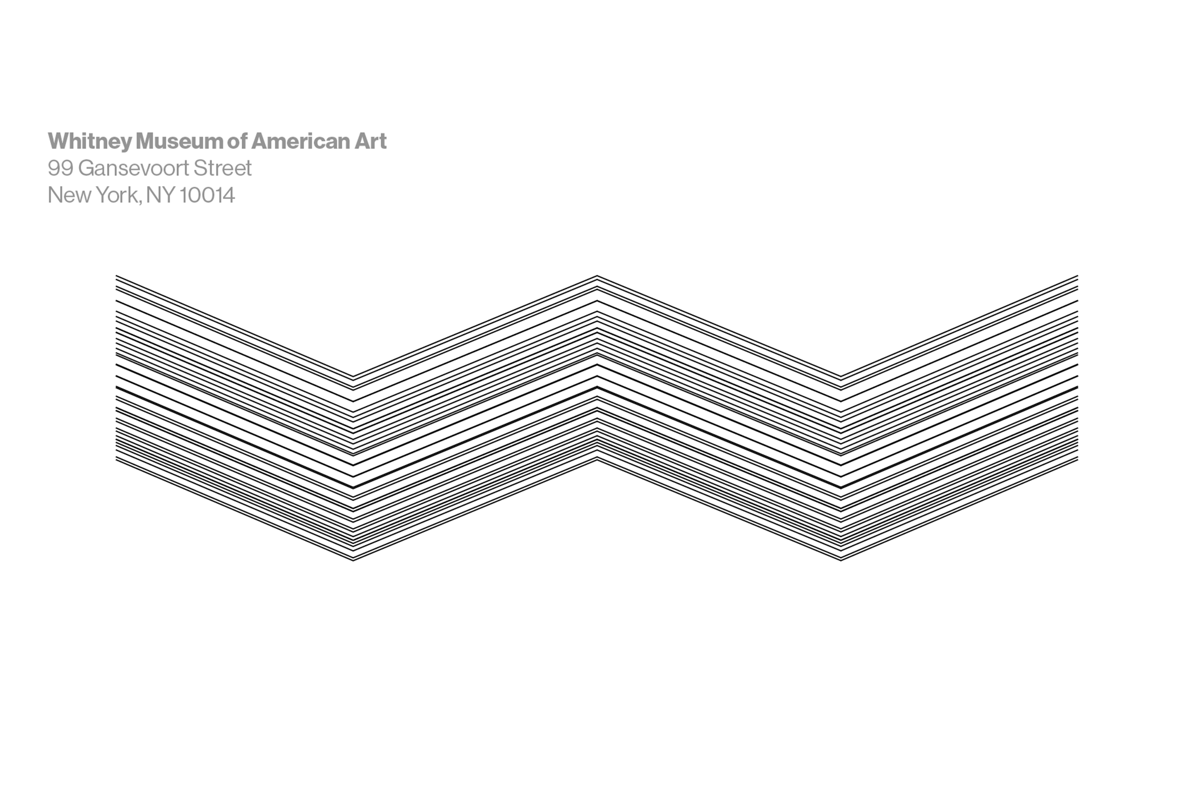
To enhance the current ticketing system, I propose a redesign that incorporates a more visually appealing and unique barcode. Inspired by the linear elements of the letter "W," this new design replaces the existing barcode on the front of the ticket. Additionally, it adds a creative touch to the back of the ticket, making each ticket truly one-of-a-kind. This design iteration aims to create a more aesthetically pleasing and distinctive ticketing experience for visitors.


Example Ticket of Iteration #1 (REAR)

Iteration #2
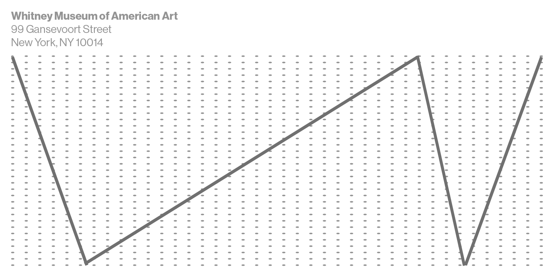
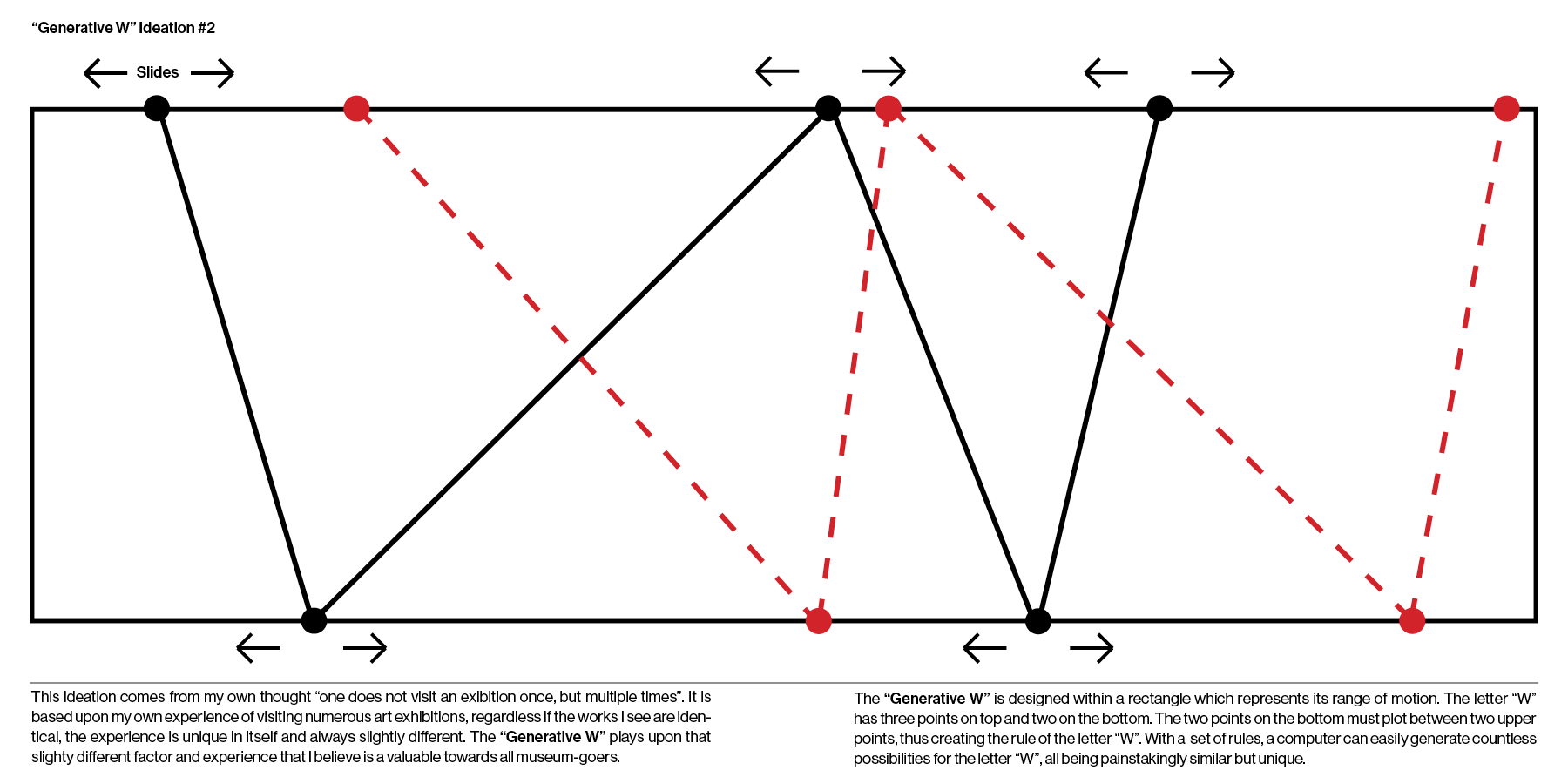
In the quest to provide a distinct ticketing experience for The Whitney Museum, inspiration was also drawn from the iconic Generative W, created by Experimental Jetset Group, which has become a defining element of the museum's identity and design since 2015.
The ideation process started by exploring ways to reimagine the barcode beyond its conventional horizontal lines. By leveraging the shape and characteristics of the letter W, along with predefined guidelines, I envisioned a novel and one-of-a-kind "barcode" design that can be trascended upon the assistance of a computing system. The barcode can then be scanned using a system that uses millions of dots to plot the placement of the barcode to its specific placement.
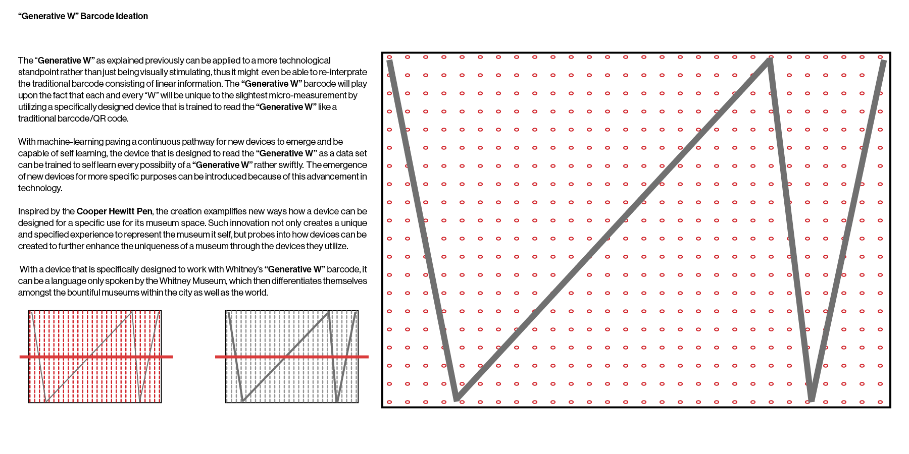
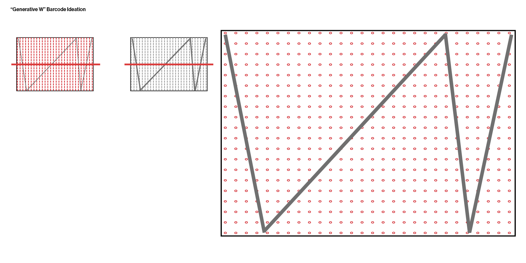
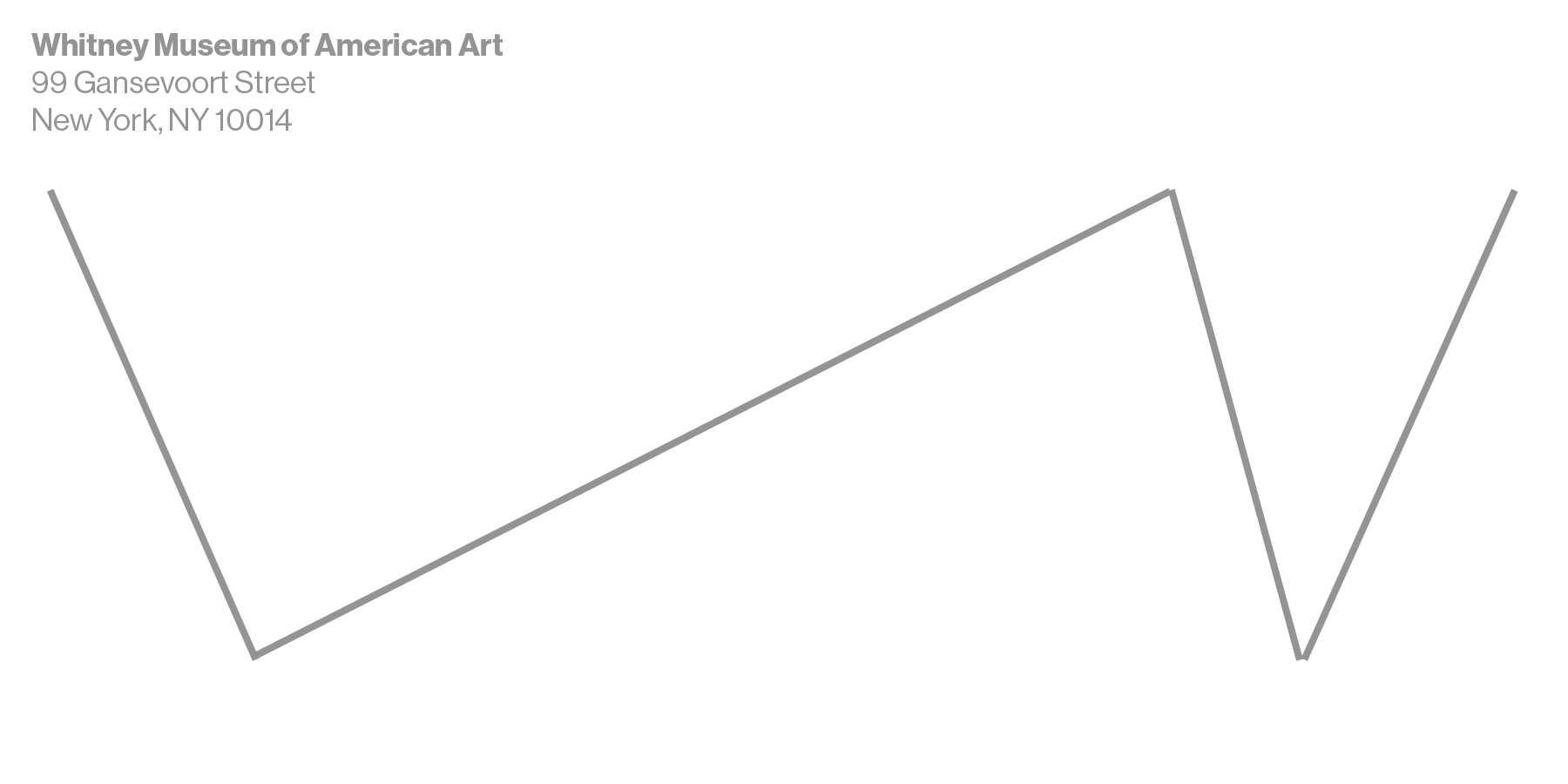
Example Ticket of Iteration #2 (REAR)
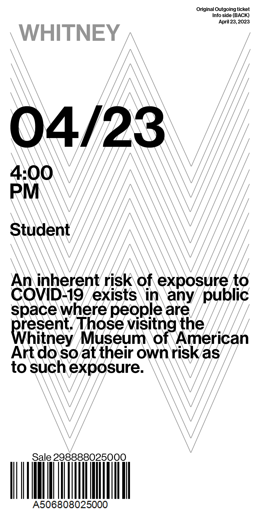
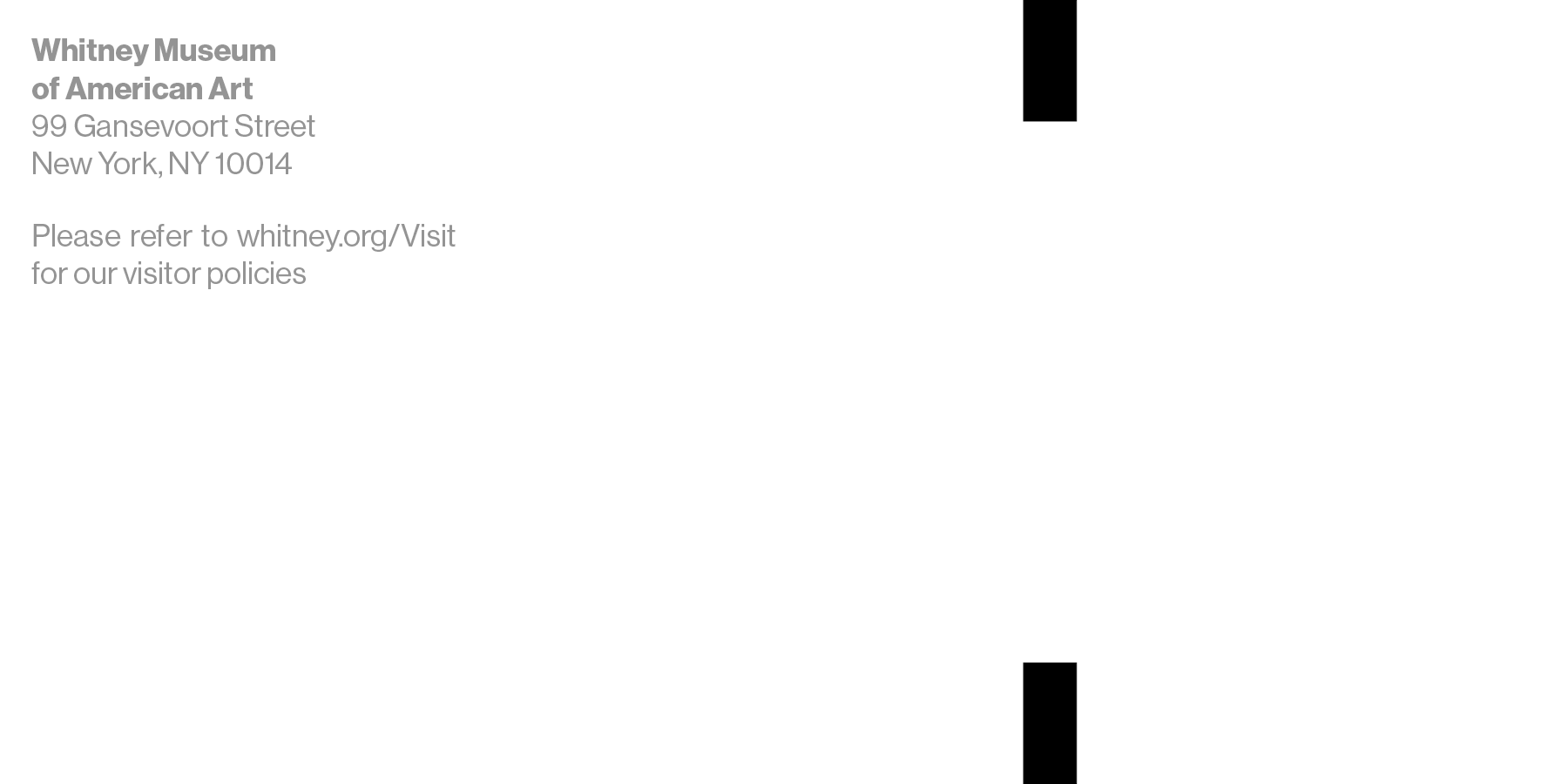
Final Outcome
Through iterating designs of the ticket, an evident outcome was landed upon. Some key elements of the final design are shown below.
- The decision to adopt a horizontal ticket layout offers improved readability and accommodates various design elements more effectively. The dimensionality of the ticket enhances its visual appeal and overall user experience.
- By implementing a distinctive barcode system specifically tailored for The Whitney Museum, I eliminate the need for a conventional barcode. This uniqueness adds value to the visitor's experience, creating a sense of exclusivity.
- Enlarging important information, such as the date, time, and user type, improves the overall legibility of the ticket. This enhancement ensures that both users and ticketing personnel can quickly and easily grasp essential information at a glance.
Front of Ticket (all information consists here)

Rear of Ticket (with re-designed barcode)
©2024 Woosung Park